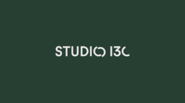
The new corporate identity for STUDIO 13C reveals a modern twist on architectural design
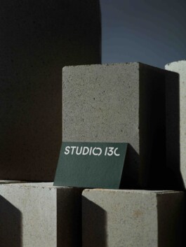
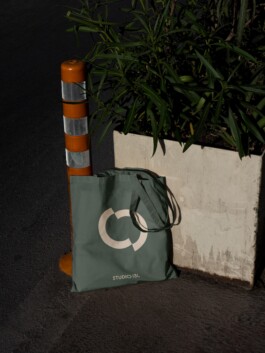
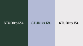
STUDIO 13C, an architecture studio led by Kay Kohler, showcases a new brand identity design, marrying modernity with architectural finesse. Central to this transformation is the striking logotype, where clean lines intertwine with a playful twist in the letter "o", echoing the essence of construction and creativity. In tandem with the logotype, the typeface "Maurice" adds a touch of sophistication and warmth, perfectly mirroring STUDIO 13C's ethos. In addition to the typography, a carefully curated color palette was introduced, drawing inspiration from the materials often found in architectural masterpieces. Dark green, pastel blue, and stone beige come together to evoke a sense of balance, harmony, and timeless elegance, reflecting the studio's commitment to both tradition and innovation.
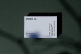
Extending to tangible elements like business cards, this cohesive redesign leaves a lasting impression. Essentially, STUDIO 13C's brand identity captures the spirit of modern architecture with a creative twist, highlighting their innovative approach and keen attention to detail.
