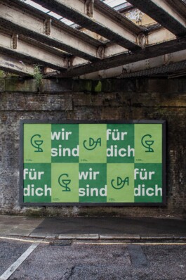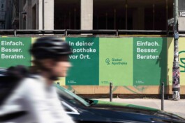
Brand identity redesign and messaging for the pharmacy Giebel Apotheke
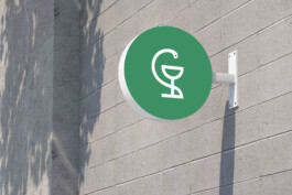
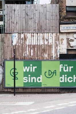
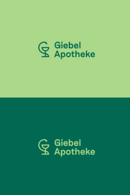
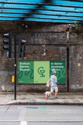
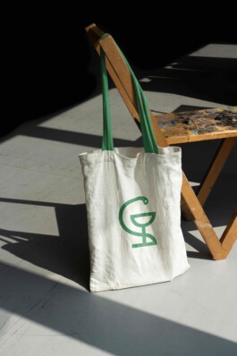
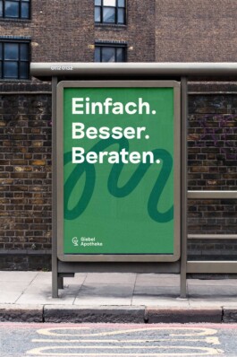
The new brand identity features an evolution of Giebel Apotheke’s previous logo which is build around the idea of the “Bowl of Hygieia” – the most ancient and important symbol related to medicine in western countries. The logo proportions are based on the golden ratio which leads to a simple and fluid look and feel. Based on the snake’s shape, a selection of wave-like abstract patterns create a dynamic graphic language throughout the identity.
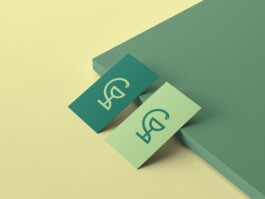
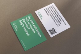
The corporate design introduces a fresh color palette which is inspired by the power of medicinal plants, including a rich and modern green as the brand’s key color.
